
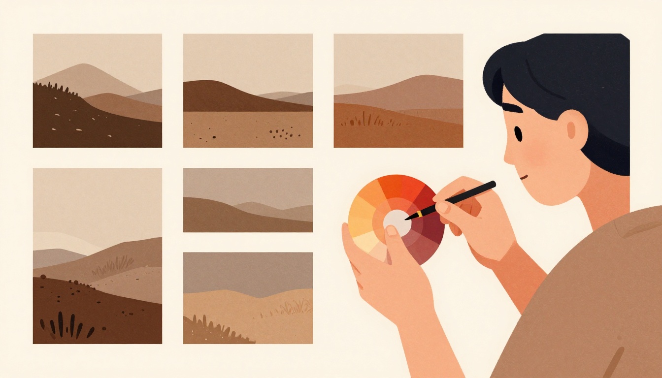
You've shot a beautiful series of images for your brand—a sunrise yoga session, a quiet corner of a design-forward hotel, a handcrafted meal—but when you view them together, they feel disjointed. The colors don't sing in harmony; they clash. This is a common problem for brands and creatives building a visual identity. A cohesive color story is what transforms a collection of individual photos into a powerful, unified brand narrative. It's the difference between a gallery that feels curated and one that feels random. Here's a practical, five-step method to build that cohesion, grounded in color theory and proven post-processing workflows.
Which of the following is a recommended first step in post-production to achieve color consistency across a photo series?
Select one answer.
Start with a color scheme, not a mood board
Before you shoot or edit, decide on a color scheme. Color theory provides the framework. The color wheel, invented by Sir Isaac Newton in 1666, organizes colors by their relationships, making it easier to create harmonious combinations. For atmospheric, calming brand imagery, a monochromatic palette—different shades and tones of a single color—creates a harmonious and unified image. Alternatively, an analogous scheme (colors next to each other on the wheel) offers subtle variety while maintaining cohesion. For a more dynamic but still controlled feel, consider a split-complementary scheme, which uses a base color and the two colors adjacent to its complement, allowing flexibility without the stark contrast of a direct complement. A good rule of thumb is to limit your palette to 3-4 main tones with 1-2 accent hues to keep the series cohesive while allowing creative flexibility.
Shoot with the end palette in mind
Your editing workflow starts in the camera. To achieve consistency, you must control what you can at capture. Use a gray card to set accurate white balance in each new lighting environment. This ensures that a white wall stays white, not blue in shade or orange in tungsten light. Also, be mindful of the ambient light's color temperature—cloudy skies produce cooler tones, while golden hour produces warm ones. If you're shooting a series over multiple days or locations, note the lighting conditions and adjust your white balance accordingly. This discipline reduces the heavy lifting in post.
Correct white balance first, then batch edit
Once you're in post-production, the first step is to correct the white balance for all shots. This is non-negotiable. As one photographer advises, "Correct the white balance for all shots first, then edit colors as a batch, fine tune to match." This creates a neutral baseline. After that, apply your color grade. In software like Adobe Photoshop or Lightroom, you can create a curves adjustment layer to sample the color tones from a reference image and transfer them to other images. This method, shared by a photographer on a Facebook group, ensures your photo set aligns perfectly in terms of color. Alternatively, in DxO PhotoLab, you can select a photo from the series that you like and apply its color temperature setting to all selected photos. The key is to work on one image as your "master photo" and then harmonize the rest to match its colors and luminance.
Use a reference photo and fine-tune
Choose one image that best represents your desired color story. Use it as your reference. In your editing software, open the reference and the image you want to adjust side-by-side. Use the curves adjustment layer technique to sample the reference's tones and apply them to the new image. This is a powerful way to ensure consistency, especially when dealing with mixed lighting conditions, like a room with both warm bulbs and cool daylight. After applying the grade, fine-tune each image individually to account for differences in exposure and contrast. The goal is not to make every image identical, but to make them feel like they belong to the same family.
Calibrate your monitor and deliver consistently
Color consistency doesn't end with editing. If your monitor is not calibrated, the colors you see are not the colors your audience will see. Calibrate your monitor regularly to ensure accurate color. Also, be aware of color spaces. Adobe RGB is a wider gamut than sRGB, but for web delivery, sRGB is the standard. Use soft proofing to preview how your images will look on different devices. This step is crucial for maintaining brand trust, as inconsistent colors across screens can erode the professional quality of your work.
Quiz: Test your knowledge
Which of the following is a recommended first step in post-production to achieve color consistency across a photo series?
- Correct the white balance for all shots first.
- Apply a creative filter to every image.
- Convert all images to black and white.
How the Featured Expert Can Help
Adrienne Leigh Moore is a Bay Area photographer specializing in atmospheric, storytelling photography for brands, businesses, and individuals. She offers immersive collaborations and nature photography services, targeting luxury eco-retreats and design-forward spaces. Her work has been featured in Architectural Digest, 7x7, CB Magazine, Caribbean Living Magazine, and Voyage LA. To see how she can help you build a cohesive atmospheric color story for your brand, visit Adrienne Leigh Moore Photography.